Oil Sketching in the Time of Coronavirus
Posted: May 3, 2020 Filed under: USkO | Tags: corona, coronavirus, oil painting, oil sketching, still life, urban sketchers Leave a comment
Hi guys, it’s Joel. Times have been tough lately, but luckily for us, we have art to keep us sane (relatively). For yesterday’s virtual sketch event, I thought it might be fun to document the process in my oil sketch. Oil paints have a reputation for being unwieldy especially for sketching, but I’ve fallen in love with the medium since picking it up about a year and a half ago. Although oil paints are associated with more finished works that take days or months to finish, you can lay down a lot of color quickly for a kind of quick rough impression, an aesthetic that I’ve always admired in oil sketches and the great alla prima masters.
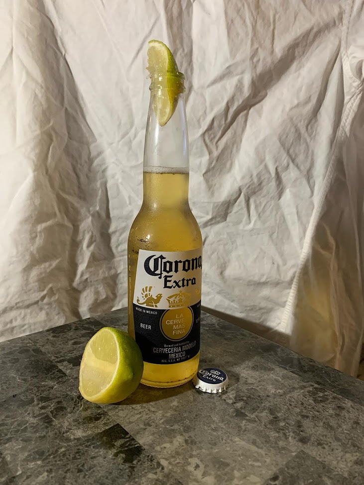
The subject I’ve chosen is once again, the topical Corona. This is my second attempt at sketching Corona, I wasn’t too happy with my first attempt. About a month ago I sketched a can rather than the iconic bottle and the measurements were a bit off. The bottle offers more color variation and the translucency of the glass and beer plays interestingly with light. I should note that I rotated the bottle slightly to make sure I got the logo facing me as I painted.
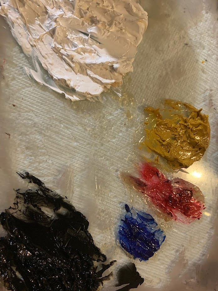
For my palette, I’m using titanium white, yellow ochre, alizarin crimson, ultramarine blue, and ivory black. The medium I’m using is Liquin, which I’ve found works best for me so far. It has a strange gel like quality and the more you play with it, the more it flows. I also have containers of Gamsol on hand as solvent/brush cleaner. While they are still flammable and should not be ingested, these chemicals are safer than some of the other medium and solvents used in oil painting. Linseed oil should be used with caution as it can cause rags to spontaneously combust and turpentine is highly toxic.
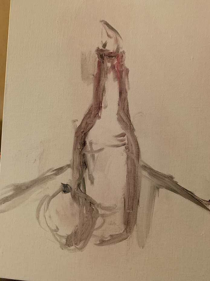
While I don’t always start out this way, the first thing I did for this sketch was lay in a drawing. Using a mixture of alizarin crimson and ivory black, I start scumbling lines across the canvas. For this sketch, I’m using 9″x12″ linen panel board. I use the sight sizing method and as you may see, my measurements are far from perfect, but I know that I’ll have the opportunity to correct as I lay increasingly opaque layers of paint down.

Next I start blocking in color, keeping the layer thin with the help of Gamsol. At this point I’m mostly trying to identify shapes of color in the subject. In looking at a 3-dimensional form, finding the shadow shapes that define that form is important in making it read properly in 2 dimensions.
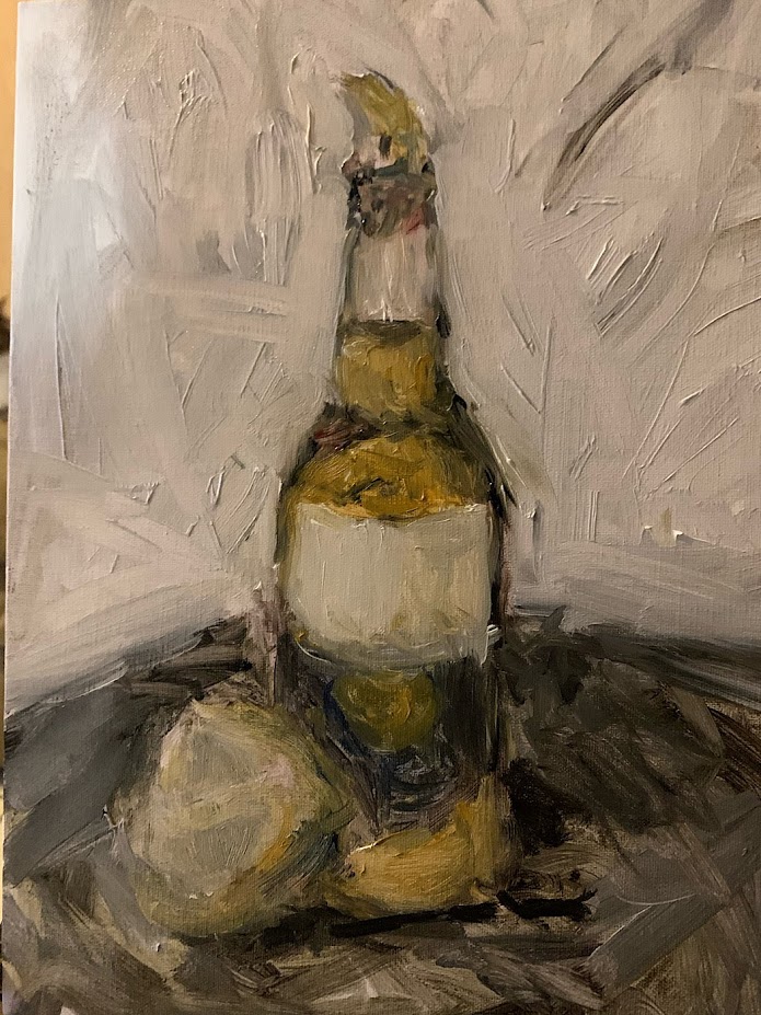
Semi-satisfied with the measurements and color placement, I start bringing in more opaque color. Titanium white and yellow ochre are the most opaque colors on my palette so mixing those colors in will bring the color forward. I do want to keep a transparent quality to my shadows so I try to keep some portions of ivory black and ultramarine blue pure to help them recede.
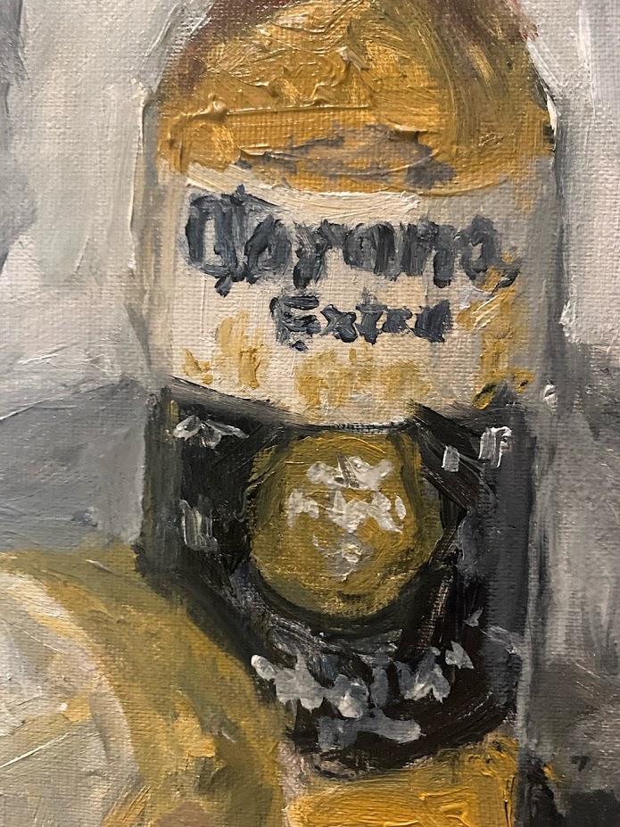
The devil’s in the details. While there is merit in drawing every line accurately and providing an exact replica of the subject, I am limited by time (I want to drink that beer while it’s still cold), canvas size, brush size, and, frankly, my own ability. It is often the artist’s job to be nature’s editor. In this case, I did not want to write out every letter and design on the label and chose to focus on the main logo, giving impressions of the other words and designs. The logo itself isn’t legible and it’s my faith that the viewer has enough knowledge of this subject that they will complete it with these suggestions.
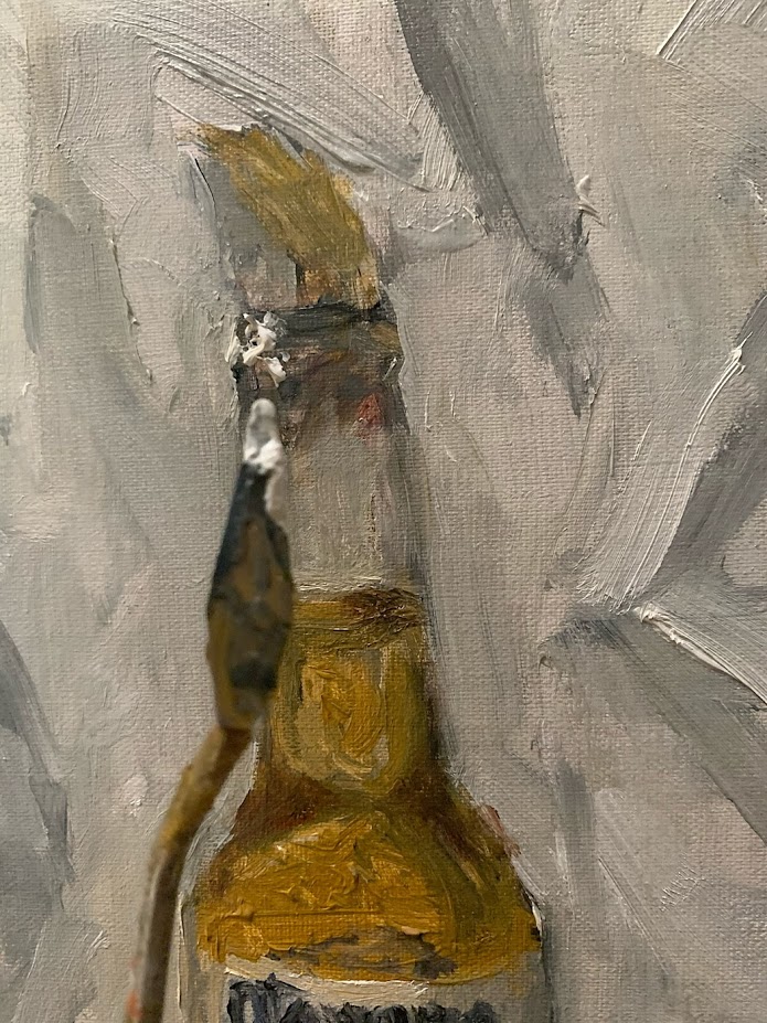
The thing I save for last are the highlights. Pure titanium white applied by palette knife to ensure that the color stays pure and sharp on the canvas.
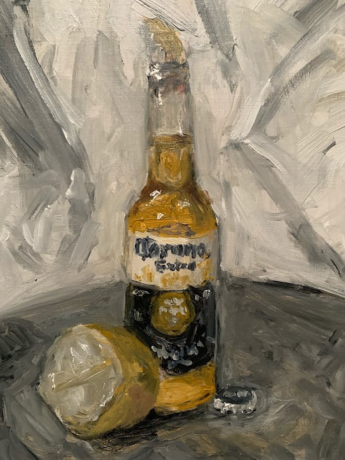
Well that’s pretty much it for this oil sketch. The great thing about working in this manner is there is an aspect of finality to it. You make choices in shape and color, and learn to live with them. This is especially true for watercolor, which I hope to improve on some day. Thanks for reading and stay safe :).